Observations on the new Observable 2.0 Framework
I’ve been a longtime fan of the interactive in-browser data visualization notebooks that are the trademark of Observable, and in general of anything Mike Bostock creates. So when the new Observable 2.0 Framework arrived, I immediately took it for a spin.
Here are my, excuse the pun…initial observations.
For the trial run, I employed a dataset I’ve been collecting from the OpenSky API consisting of celebrity private jet flights from 2023. I retrieved their jets’ tail numbers from a database set up by the college student being sued by Taylor Swift, then looped through these codes to retrieve around 17,000 total flights taken by 200 famous people.
If you want to play around with the example yourself, the code is here and the deployed project is here.
You can do all the analysis and visualization in one place…sort of
A key concept in the Observable Framework is data loaders. I use Python for analysis and Javascript for visualization, and Observable Framework finally allowed me to unite them in one place.
Before this dropped, we had to create an analysis repository where we stored our python scripts. I would pull some data from an API or a database, transform it in a python script, and then upload the results to S3.
The frontend visualization code lived in a separate repo and pulled in the cleaned data. Whenever the analysis needed to change, I had to re-run the scripts to update the data, then switch back to the frontend code and tweak the visualization.
So one of the most enjoyable moments of using the new Observable framework was editing a line of Python, and watching my viz hot reload on the page.

For the jets project, I created this simple data loader. I set up a virtual environment for the Python - this isolates your libraries from potential conflicts with packages installed elsewhere in your system.
Then I could install and import any python data viz libraries in the project, and pull in the data stored on S3.
import pandas as pd
import sys

# loads all flights
url = "https://s3.amazonaws.com/data.ap.org/projects/2024/private-jet-emissions/all_flights_2023.json"
df = pd.read_json(url)
Note that I already collected and cleaned the data in a Jupyter notebook to keep the Observable example simple, but in theory you could start with a raw dataset and do it all in the data loader.
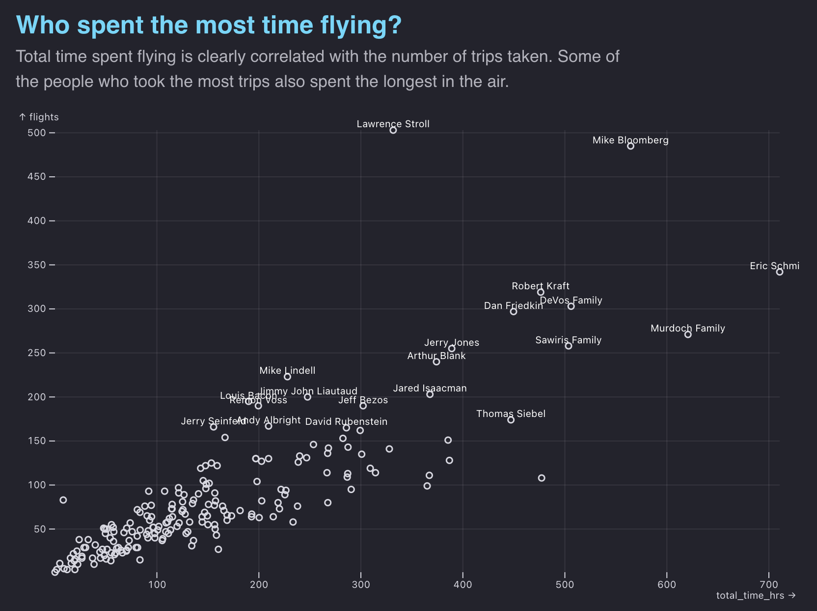
Then using the pandas library, I aggregate the data by jet owner, adding up the total flight time per person.
ppl = df.groupby('owner').agg(
{'icao24': 'count', 'flight_time': 'sum'} ).reset_index(
).sort_values(
by = 'icao24', ascending = False)
ppl.columns = ['owner', 'flights', 'total_time']
ppl['flights_per_month'] = round(ppl.flights / 12, 1)
ppl['total_time_hrs'] = round(ppl.total_time / 60, 1)
The return value of the data loader is a csv file. This is the “snapshot” our visualization will pull from. It’s lightweight, with only the aggregated data we need to draw the chart.
ppl.to_csv(sys.stdout)Only the data we need will be shipped with our code. If I want to tweak the analysis, for example visualizing average instead of total flight time, I can edit that in one place and watch the chart update.
While this streamlines the analysis to visualization pipeline, I had a few concerns.
First is scale. Observable says that these data “snapshots” are more performant than querying a database every time a user interacts and wants to see the data sliced in a new way. This is true, but what if you have a dataset with millions of rows or hundreds of features? As you add more interactions and filters, the combinations and possible snapshots begin to pile up.
Second, when developers are writing real-world analysis code, we’re usually stopping to check the output every few lines. This is what makes cell-driven notebooks such as Jupyter and Observable 1.0 so popular. Data loaders in their current form are great for analysis that is polished already, but needs more debugging and logging tools to really replace a first analysis conducted in a notebook.
It’s optimized for content-driven data viz sites
The other cool feature is writing your code in Markdown files that integrate CSS and JS.
A key issue that data journalists face is wrangling a lot of text content with interactive visualizations. Some solutions such as ArchieML, aim to solve this problem by giving writers user-friendly tags that compile their content to Javascript objects.
Observable’s Markdown files are a perfect solution to this. Many common data viz libraries that form the Observable ecosystem are imported and configured out of the box. You can weave complex custom interactive viz with text.

We can render this narrative text as simple markdown, styled with basic CSS.
Loading data is extraordinarily straightforward thanks to top-level await and global variables. There are no async functions or handling of promises needed. There are no state hooks or reducers. Just a single line of JS, and we have all the data we need to render out a chart.
Here’s how I referenced that data returned earlier by that data loader.
const flightsByOwner = await FileAttachment("data/flights.csv").csv({
  typed: true,
})
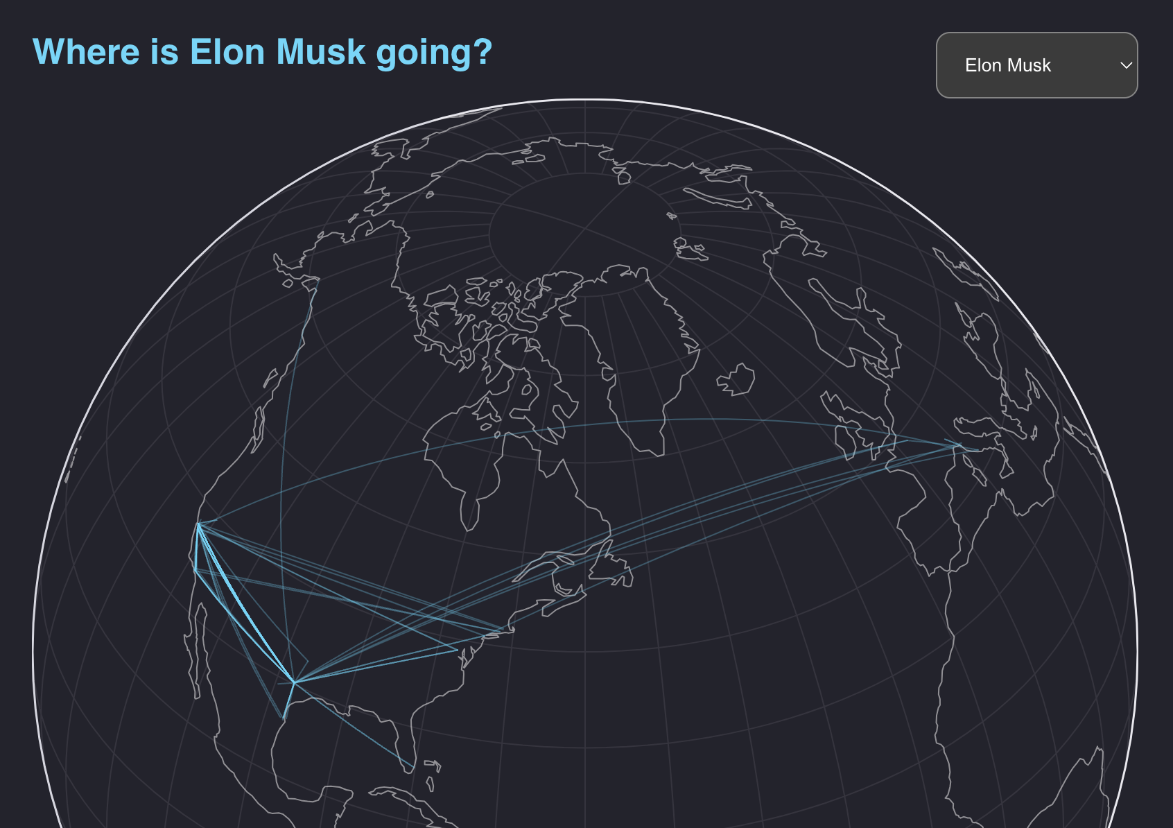
One of the visualizations on the page is a globe where readers can select a celebrity and see where their private jet flew in 2023.

This demonstrates how Observable’s whole ecosystem of libraries come together in this framework. Here, I load geographic data in performant topojson files, and transform it into GeoJSON.
await visibility()

const flights = await FileAttachment("./data/2023_flights_geodata.json").json()
const landData = await fetch(
  "https://cdn.jsdelivr.net/npm/world-atlas@2/land-110m.json"
).then((d) => d.json())

const land = topojson.feature(landData, landData.objects.land)

const flightsGeo = topojson.feature(
  flights,
  flights.objects["2023_flights_geodata"]
)
The await visibility() is a handy utility provided with the framework that allows you to “lazy load” these resources - it defers running this block until the user scrolls to this area of the page.
Then let’s give our readers a menu to choose a person of interest.
We can drop JS blocks right in the same file. This is how you create an dropdown in Observable and save it in a global variable. Here we save a reference to both the input itself, so we can render that in the html, and the selected value (“person”).
const personInput = html`<select id="ppl-select">
  <option value="Elon Musk">Elon Musk</option>
  <option value="Jeff Bezos">Jeff Bezos</option>
  <option value="Lawrence Stroll">Lawrence Stroll</option>
</select>`

const person = Generators.input(personInput)
Now we’ll render this input. For times like these when we need more CSS properties and control over the styling, we can write HTML straight in the same Markdown file!
We can naturally extend this with JSX-like injection of Javascript.
<section>
    <div id='selector'>
        <h2>Where is ${person} going?</h2>
        ${personInput}
    </div>
        <div>
        ${Plot.plot({
        width: width,
        projection: {
            type: "orthographic",
            rotate: [60, -40],
        },
        marks: [
            Plot.graticule(),
            Plot.sphere(),
            Plot.geo(land, { stroke: "white", opacity: 0.5 }),
            Plot.geo(flightsGeo, {
            filter: (d) => d.properties.owner == person,
            stroke: "#53d8fb",
            opacity: 0.3,
            }),
        ],
        })}
        </div>
</section>
The “back to basics” aspect of this approach is refreshing. Many modern JS frameworks have added one too many layers of abstraction. We commonly add a React library to wrap another JS library in declarative code. We’re sometimes shipping 45kb of JavaScript just to load React and its virtual DOM, just to render our HTML on the page. This is overkill for content-driven sites with small islands of interactivity.
The Observable Framework keeps the logic for rendering interactive content, and the expository text that supports it, in the same place.
It still has a long way to go to get up to par with modern frameworks
This worked great for a single page with a few visualizations. But let’s think about re-usability, modularity and scaling to complex UIs with a beefy component tree. Observable has some nice CSS components for things like cards, tables, and other commonly recycled items. I expect they’ll add more soon.
But for now, we’re still stuck writing a lot of Observable particular flavor of vanilla JS on steroids. Despite its neat features, this can quickly add up to hundreds of lines of code to solve basic problems, which is why we wound up with the overwrought modern framework situation in the first place.
And if you have framework components to solve these problems already as part of your team’s component library or design system, you’re out of luck.
A valuable feature would be to be able to integrate React or Svelte components. Astro set a prime example of this with its component “islands.” These are isolated sections of a page that load on the client, providing full interactivity and the ability to write components in any modern framework with a plugin.
A similar approach would make sense for Observable, given the popularity of Svelte and React for data viz.
Observable solved a key problem here by integrating the analysis to visualization pipeline from start to finish, in one place. While it has a few hurdles to overcome, this is a powerful new tool for building custom dashboards and narratives.